Why more options can make a simple task feel harder


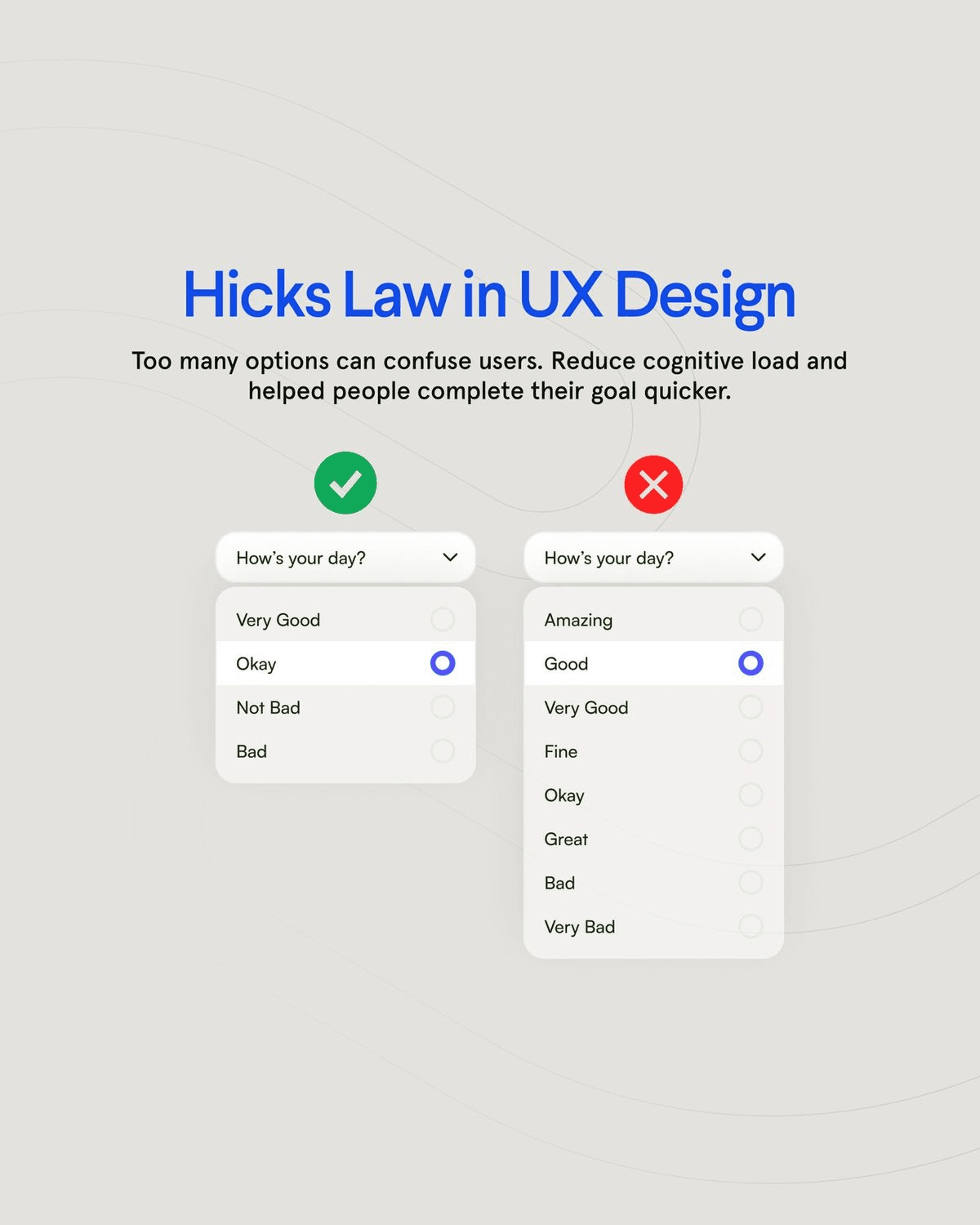
A user opens a small menu to record how their day went. The first version offers four clear choices, and most people can answer without thinking about the interface.
As the product grows, the team adds more precise moods, a neutral option and several labels that mean almost the same thing. The menu is richer, but users now hover between choices, reopen it and wonder which answer the product expects.
Removing options would make the decision faster, but it might also remove useful nuance. The interesting question is therefore not how to show the fewest choices. It is how much distinction the task genuinely needs, and whether grouping, defaults or progressive disclosure can preserve that value without making a simple action feel like work.
The delay is in the decision
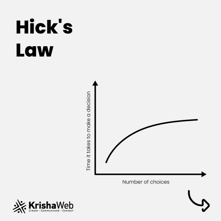
Hick’s Law gives us a way to explain the hesitation: as the number and complexity of choices increase, deciding generally takes longer. I find it useful because it shifts the review from “Can we fit another option here?” to “What decision are we asking someone to make?”
A long list is not automatically bad. The problem appears when several options look equally important, use similar language, or require someone to understand the product before they can continue. That is when a small interaction starts feeling like work.
Reducing friction is not the same as removing choice
I do not use Hick’s Law as an excuse to remove useful controls. Sometimes the right answer is a better default. Sometimes it is grouping related actions, using clearer labels, or revealing advanced choices only when they become relevant.
The goal is not the smallest possible interface. It is an interface where the next step is understandable. If every action is given the same visual weight, the user has to create the hierarchy themselves.
How I use it in practice
When I review a screen, I start with the task rather than the component. What did someone come here to do? Which action should be obvious without explanation? Which choices can wait until the user has more context?
- Does this choice change the outcome now?
- Can it wait until the user has more context?
- Is there a safe default that remains easy to change?
- Does the user understand how the options differ?
- Is this needed by most people or only a specialist case?
I would then watch whether people reach the intended action without pausing, backtracking, or opening several controls first. Hick’s Law is not a rule that tells me exactly how many options to show. It is a reminder that every choice has a cost, and the interface should make that cost worthwhile.